Friday, May 25, 2007

Cami Tutorial and Questions

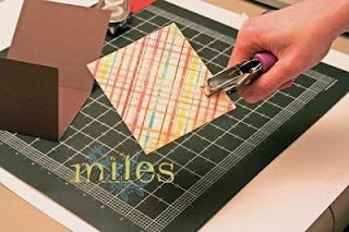
As promised I am including a tutorial and question session in today's post. To view the full card in it's entirety, please see yesterday's post.
I am still a few thousand posts (ok 3000) away and just wanted to give you the heads up that I plan to celebrate 50000 in style so be sure to check back in the next week for some blog candy.

Cami Tutorial

Supplies

Step 1: Cutting the CS 4.25 x 5.5


Step 2: Scoring the "right" lines at 3.5 then 7

That should leave you with scored areas 3.5-3.5-4.25
Then cut various pieces of DP for each of the scored areas.


Step 3: Getting Punchy


Step 4: Colouring/Stamping


Step 5: Doodling


Step 6: Roll out the tape ribbon (7 Gypsies WOHOO!)


Step 7: Adhere all your layers, add your ribbon and VOILA! a beautiful cami card.


One thing you will notice is that I often stamp in steps. You might as well get all the punching done at the same time, all the stamping at the same time etc...


Alli vs the Questions 4

1. What are your favorite card layouts or strategies for working with small graphic elements?

My favourite card layouts are simple. I like only one of two elements. There is something to say about a card that has very few layers and embellishments. It just speaks! Hmmm I am not sure if I completely understand the question but let me answer this how I am reading it…I tend to use more when I have small graphic elements, like repeating or using as backgrounds. If I didn’t answer that question the way it was asked please feel free to ask me again.

2. I am wondering how you come up with so many ideas for one stamp...I am a struggling student and I need to get my money's worth!!

This is a FANTASTIC question. The truth of the matter is colour. When I see colour, especially colour combos from DP I just go to town. It inspires me to try something new with the same stamp/stamp set. You can change a card a lot by changing a few elements. My very first post of SCS shows how I used a single stamp set to come up with a variety of cards (my SCS gallery name is themilesmum). Perhaps I might suggest looking at the SCS challenges. The sketch challenge would be ideal for what you are talking about. You can look back at ALL the sketches and draw inspiration from them. The same can be said about the colour challenge. I hope this helps.

3. Thank you for sharing your blog, ideas and artwork. Where do you get your inspiration from and what non SU! sets are you currently using a lot of?

My inspiration comes from so much but it is colour that got me started. Once I started playing with colour it just came together for me. Of course that meant I had to have one of EVERYTHING in EVERY. Colour sets the mood for the card and the images tell the story. Each little embellishment has its place too. I place certain things on my cards for balance, direction etc. As for current sets, my fav, other than SU! are Papertrey Ink. I love them so much because they are fresh! I love their versatility too. I like how you can use the stamps from all the sets and they seem to just fit in. In addition, I am just loving the fun cutesy images from Stampendous. The Bees and the monkey (Changito).

4. I enjoy reading your blog, especially the entries about the chipboard. If you don't have a Cuttlebug to cut pieces from the chipboard, what else can you do with them?

Chipboard…hmmm…I like to do all sorts of things with chipboard. If you don’t have a Cuttlebug, you can still use the chipboard coasters to make boxes, books, add dimension on your card, create borders.

5. My question to you is: How do you get your inspiration? Do you case and then tweak it a bit? Do you copy from magazines (I've seen a lot of people looking at bedspreads and come up with card ideas which is awesome but I am not that creative!).

I promised I would share my journals with you and I will be doing that soon. I had planned to do that earlier but as always, there are more creations that I am just too anxious to share with you first. When I first started stamping my inspiration was from the SU! Idea Book and Catalogue. I simply started to case and went my own way. Then I felt I had to come up with things all on my own. When I was doing classes and workshops all the time I was starting to get really stressed out about it. So then I would case the layout and change my colours and stamp sets. When I first started sharing on my blog they were all my own designs. And although most still are, I participate in the SCS challenges quite a bit so those sketches and colour combos aren’t mine. The thing with the challenges is every person comes up with a unique card. So even tho the sketch is not mine per say I add my own special/unique twist. Nowadays I am inspired by everything. If I see a card that I like I try to figure out what attracts me to it. Sometimes I will print it off and circle the area that appeals to me. Ribbon loops is an example of something I saw somewhere else but have incorporated into many of my designs. Another example was scalloped circles. When I first saw them it was love at first sight. I wanted MORE! Sometimes it the DP, the ribbon, the ink…you know all that stuff that THOSE BLOGGERS (me included) enable when not even meaning to enable.

I am a good chatter at the best of times so I better stop here today. I will have more questions for you in the next few days.

Because I love to stamp and you do too!

Alli

3 comments:

Elizabeth Royalty said...

Hope I left a comment on the previous post about how much I love this card (the colors are just too yummy), so thanks for the awesome tutorial, too!!! I feel a case coming on.... :)

Beth Thomas said...

Love, love this card! Thank-you for sharing the tutorial!

Jill said...

Great tutorial and what a beautiful card!!