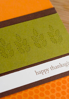
One of my favourite images from this set is this leafy stem. What I love about it most is the dotted leaf outline. It just adds another element to the leaf.
CARD #1
I created this card with the notion of simplicity meets rustic. I stamped the background layer using polka dot basics stamp set and then distressed the edges of the remaining layers. I added the twine and the button as well as a cut out sentiment
INSTRUCTIONS
- Create card base, layers and die cuts.
- Stamp image, background and sentiment.
- Distress paper.
- Attach twine and thread button.
- Adhere all layers.
SUPPLIES
Stamp Set(s): image from Gobble Gobble by PTI available August 15th, sentiment from Take Three: Fall by PTI available August 15th, Polka Dot Basics II by PTI
Cardstock: Kraft by PTI, Stampers Select White by PTI, Hawaiian Shores by PTI
Ink: Hawaiian Shores by PTI, Dark Chocolate by PTI, Snow Cap by PTI
Accents: Button by PTI, Twine by PTI
Tools: Nestabilities by Spellbinders, Distress tool
CARD #2
Here is another look using the same stamp but in a completely different way! There is something really great about repeating an image over and over.
INSTRUCTIONS
- Create card base, and layers.
- Stamp images, background and sentiment.
- Adhere all layers.
SUPPLIES
Stamp Set(s): Gobble Gobble by PTI available August 15th, Polka Dot Basics II by PTI
Cardstock:Dark Chocolate by PTI, Vintage Cream by PTI, Orange Zest by PTI, Ripe Avocado by PTI
Ink: Dark Chocolate by PTI, Orange Zest by PTI, Ripe Avocado by PTI
I'd love to hear which one of these two cards is your favourite and why? Thanks again for stopping by. I'll see you back for Day 3 of the previews!
Alli


10 comments:
Beautiful CAS cards - great colours. Love the layout of the first one.
Another great image from this stamp set! How am I ever going to decide on the 15th which sets to get??? You DT members make it so hard!!!
OMGOSH, the craft, white and teal together are so fabulous! Love the rough edges of the craft. LOVE the stitched look to the image!! Stunning look!
I LOVE that first card! Such a good balance of blank space and stamping. I love how my eye is drawn outward from the center to the edges. Beautiful!
Love the layout of the first card, great combo of rustic simplicity. However I'm traditional and love the color combo of the second card. Both are beautiful. Thanks for sharing!
These look like such fun elements... love 'em! :)
Gorgeous, I love that rustic meets simplicity card-beautiful colors.
I love card #1. So peaceful and simple, but so pretty. Super design!
These are so nice - simple & chic! Thanks.
I love the simple dotted outline of the leaves. They are beautiful!
Post a Comment